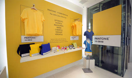
…because you’ll be seeing it everywhere. Once color marketing and trend forecasters like Pantone and Color Marketing Group announce their predictions for popular color, manufacturers listen. Companies like the Gap and just about any retail manufacturer prepare their interpretations fashionable color the minute these reports are available and cater everything in their lines to coordinate these hues. If you find yourself asking what is it really that these people do, just imagine trying to explain a color to another person – one man’s red is another woman’s cerise.
These companies primarily identify and communicate color to the design industries. An offshoot of that function is that these companies forecast “new” colors for retail seasons. Manufacturers and designers join these groups in order to have access to their color card sets, which make our lives much less complicated. Want a new background for your website? Tell your webmaster to use color X from the Pantone system – most any graphic designer will be able to find that color in their trusty color card set and poof! If you desire to emote an image of hopefulness, energy, and optimism, this year you MUST use bright yellows.
Pantone’s offering for the season is PANTONE® 14-0848 Mimosa, as “the color yellow exemplifies the warmth and nurturing quality of the sun, properties we as humans are naturally drawn to for reassurance,” explains Leatrice Eiseman, executive director of the Pantone Color Institute®. “Mimosa also speaks to enlightenment, as it is a hue that sparks imagination and innovation.”
Color Marketing Group predicts:
“Purple, Purple, Purple! – Emerging as a hot fashion color last fall, purple is not just a fad — it’s an entrenched trend, strongly influenced by the election. (After all, red plus blue equals purple.) Look for a greyed-out violet that works equally well as an accent or a neutral, as well as redder, plummier purples and bluer-influenced fuchsias in a huge range of products. Purple is 2009’s “must have†color.
Blue is the New Green – Various greens have symbolized “green living†over the last few years, but in 2009 the “green” environmental message is delivered by the color blue. There are watery blues, sky blues and a whole range of blues that now represent our commitment to living on a greener planet.
Cooled-down, Greyed-out Browns and Greys – Complex neutrals satisfy our urge toward classic colors in an economically challenged time. They also bridge the area between black, which seems harsh, and brown, which doesn’t seem strong enough.
Yellow for Energy – The neutrals may have greyed, but look for lots and lots of bright vivid yellow to give us energy as we re-build the economy. It’s the stand-out accent color for 2009.
Bright Accents from India, China, and Turkey – The exotic has become the familiar. Oranges, turquoises and teals, reds, and yellows will abound in hues from far-away countries that now seem very near. They are the optimistic touches we crave.
White is now a Business Color – Technology has produced amazing new (and very practical) finishes, which helps explain why white is showing up everywhere, even in corporate board rooms. The contrasts are all in the finishes: matte versus gloss; shine and shimmer on reflective surfaces; textured whites versus smooth — all washable and cleanable. White also represents purity of thought, motive and result – exactly what we want from businesses now.
The Return of the “M” Word – It’s mauve. Remember mauve? An old color that looks new again, in dusty violet shades, mauve works as an accent but also serves now as a neutral, punched up by those bright Asian accents (orange, turquoise, teal, red, and yellow.) ”
I’ve been telling anyone who would listen for the last five years that the new milleneum will revive teal and mauve – so now you have it from the experts.

 Logging you in...
 Loading IntenseDebate Comments...